Thursday, 2 January 2014

Five designers + Infographic design

The five designers:

Art Noveau

Alphonse Mucha style is characterized by the art noveau elements, tender colour and decorative elements. His posters were of young women with long hair and refined costumes. These female images became his trademark, he became famous in 1894 with his commission for a poster for the actress Sarah Bernard who at that time was a celebrity, and he designed all of her posters but also the costumes and decorations for her theatre as well. The designer has made many commissions for all kind of commercial print advertising. He produced many paintings, illustrations, advertisements and designs.

Public recognition:

1890 Alphonse had displayed 448 works on displays in Paris, between 1904-1921 Mucha taught art at academies in New York and Chicago.
Dieter Wanczura , Alphonse Mucha Biography 1860- 1939 [online], available at: http://www.artelino.com/articles/alphonse_mucha.asp, [accessed 02/01/2014]

Maximfilm 2008, Alphonse Mucha - Art Nouveau Visionary (Trailer) [Video], Available at:

De Stijl & Bauhaus

Piet Mondrain began his work represented form, favouring naturalistic and impressionistic landscapes, his style influenced by Picasso and Braque as it morphed into his signature non-representational form which termed as Neo-Plasticism. It was through this form that he became an important contributor to the De Stijl art Movement.

Constructivism:
El lissitzky was a Russian designer exhibition in the 20th century; he used abstract shapes he referred to as “prouns” which helped him define his compositions. These shapes were developed in 3-dimension space and contained different perspectives, he continued his propaganda posters and buildings. He used shapes to create the sense of spaces as well as balance he also shows us to think outsides the box when we are creating; some other similarities include perfect shapes and imperfect shapes.
Brandomnembrose 2011, Brief summary of El Lissitzky Proun series [Online], available at: http://brandonambrose.wordpress.com/2011/02/21/brief-summary-of-el-lissitzky-proun-series/ [accessed 02/01/2014]

The New York style: 

Paul Rand had influenced many designers another leading artist at the time was Saul Bass, Saul Bass created many title sequences, the new design started moving from New York and made itself to Los Angeles thanks to Saul Bass who in the 1950 opened a studio, Bass usually used a single image to dominate his designs, he was commissioned by Otto Preminger a film director to create graphic design for his films, for examples: logos, posters, advertising and animated film title sequences. He made the title sequence of “The man with the Golden Arm, Anatomy of a Murder and Psycho.
Moda 2013, Paul Rand: Defining design [online], available at:http://www.museumofdesign.org/2013/02/paul-rand-defining-design/ [accessed 02/01/2014]

Punk


Jamie Reid style techniques and characters:  Photocopying, shocking colours, collage, use of lettering cut up or torn out of newspapers screen printed and recycled imagery, overprinting, cluttered pages, intentional mistakes, and unpredictable use of destructive and anti–capitalist slogans which created shocking often and offensive juxtaposed images. The birth of the Punk movement created both an evolution and revolution in the world of modern design.

Info graphic Design 1
Info Graphic design 2


Saturday, 28 December 2013

Corporate identity part 2

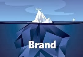
Further focusing on corporate identity, as mentioned in one of my previous post corporate identity developed in the 1950s, an increasing number of organisations started branding, big organisations benefited from the use of corporate identity, knowingly an individual would distinguish a popular brand, because of its logo, for instance computer brands one would tell if it is an “Apple” product by the logo that is found on all of apple’s devices.


Corporate identity started to be used universally in the 1960’s and 1970’s as it was recommended for all companies for them to have their identity. Popular brands keep on reinventing their visual image to make it fit into society.  Rebranding for instance is the process where the corporation is trying to present a new different image to the same target audience and hoping to attract other individuals to their market, it could involve minor or radical changes to the brands logo, brand name, and image, advertising and marketing strategies. This is normally done to reposition the brand to a better level of marketing or to just keep in times with society. A brand identity normally changes with the content it presents to increase its reputation.

Individuals might have mixed feelings about brands, popular brands for example are more trusted than a brand that might have just started out, people fall in love with brands, and develop strong loyalties to the company. There are plenty of individuals that buy most of the products of the brand they respect, for example: plenty of apple fans always want to upgrade their phones to the next generation because it’s a new apple product.

Anon 2011, Corporate ID [Online] , available at: http://www.designishistory.com/1960/corporate-id/, [accessed 28th of December 2013]


Anon 2011, Corporate identity + Branding, availble at: http://www.designhistory.org/Symbols_pages/Branding.html [accessed 28th of December 2013] 

Monday, 23 December 2013

Post-Modernism

Post-modernism is a late 20th century movement, roughly late 1970s and early 1980s. Plenty of individuals did not know what the term post modernism meant or what it meant to represent.
Post modernism is hard to define because it follows various areas of study, art, architecture, music, film, literature, design, sociology and plenty of other subjects. 

Post modernism rejected rigid genre distinctions, irony, playfulness, parody, bricolage , and emphasizing pastiche. Postmodern favours the designer or artist to reflect and show expression by bringing what they thought to life, discontinuity, ambiguity, simultaneity and emphasis on the decentred subjects.

The idea of postmodernism seems very much similar to modernism which follows similar ideas; however postmodernism has a dissimilar attitude toward these trends.  Modernism tried to provide unity, coherence and meaning, in contrast postmodernism likes the idea of fragmentation, incoherence and likes to play around with nonsense.

For one to understand what post-modernism is it one has to think about modernism first, designs were decorative for functional objects, in this case a sewing machine and then it is put into these elegant and decorative patterns which later end up on the machine. Modernism saw that there was a great deal of effort into creating features of the decoration. They made elegant but not very functional designs. The idea of modernism was form follows function.

What Postmodernism tried it to create something decorative, it added strange out of the norm colours, textures testing things out in a humorous and interesting fashion, designers did not do it purely for the function, as mentioned above they did it with emotional interest or aesthetic engagement, which produced a movement to par with modernism.

Plenty mention that modernism and postmodernism is nothing alike, the rules are totally against each other, which when it comes to rules is very true, the colours used, textures, designs, literature and plenty of other things.

Here is an early influence of post modernism from the punk movement entitled “God save the queen” a design by Jamie Reid for the cover of the sex pistols band, the characteristics of this design could be seen in plenty of the characteristics in postmodern design for example the case of type, no organisation and visual wit in their designs.


The British youth culture magazine, I-D was an iconic representation of the postmodern graphic design aesthetics in its publication in the 1980s, the magazine was designed by Terry Jones, who uses aggressive collages, heavy use of colour, experimental typography, dramatic designs.
An important character of postmodern design is the idea of anti-humanism, which is why many humans do not share the same ideas.  

Reference: 
Bill Moggridge, what is post-modernism in design? [Video] available at: http://curiosity.discovery.com/question/post-modernism-design, [accessed 23rd of December 2013]

Anon 2010, Modernism vs Post-Modernism [blog] available at: http://www.bdavetian.com/Postmodernism.html , [accessed 23rd of December 2013]

Meggs P. B. and Purvis A. W. 1998. 5th Edition. Hoboken, New Jersey: John Wiley & Sons , Inc.


Tuesday, 17 December 2013

Psychedelic movement

The word itself psychedelic in mind is to produce vivid visions which affect the mind greatly, the art techniques themselves are immensely powerful it is as if the designer was hallucinating while doing it as if he or she was in a kind of drugged state to produce this kind of work, however it is very fascinating on account of the designer had to be in a different state, exploring abnormalities that make the movement interesting.

There are several movements and techniques, which inspired psychedelic for instance the flowing curves, textures from the movement Art Nouveau, the use intense colour, practically undecipherable letters, complimentary colours, making use of popular culture images. Plenty of the designers in this movement were inspired by Pop art. Other things that inspired the psychedelic movement:  Rock musicians had inspired fashion had inspired youth culture, vibrating effect in graphic lines and texture was made into many wall paper designs, underground comic book styles were also popular.


Social life was absolute chaos during this movement, which have inspired a large number of artists and designers to create interesting, designs, magazines. Even fans created interesting magazines themselves, in spite of not being designers themselves they created interesting magazine concepts titled “Fanzines” it is basically a nonofficial and nonprofessional published work, created by fans of a particular culture, fanzines improved over the years, in the beginning fanzines  were hand-drafted or typed, only a limited number were made at the time, but eventually grew popular, however since technology developed greatly, there is a little difference between a normal fanzine and a professional magazine.

The movement developed in the mid-1960. The Psychedelic movement had affected cultures, lifestyles, music, social activities, literature and various other day to day activities.  

Victor Moscoso was a trained designer in the psychedelic movement, one of his techniques was to reduce a photograph to its most essential shapes, Art Nouveau inspired curvilinear shapes, illegible hand-drawn type and intense optical vibration which was inspired by the Pop art movement.  Moscoso applied what he had learned about the colour theory and  turned it upside thereby creating colour discord by colliding up colours of similar intensity next to one another. Moscoso had designer over 60 concert posters within eight months.


Peter Max was another influential designer of the psychedelic movement; Peter Max used softer colours and more accessible images, simple outlines illustrations which were often gave a comic book feel to his work, however his ideas were very inspiration he also rejected most of the anti-establishment values of youth culture and focused on softer ideas.


 Reference 

Anon, 1960-1975 sixties’ Psychedelia [online] available at: http://gds.parkland.edu/gds/!lectures/history/1960/psychedelia.html [accessed 17th December 2013]

Renee T. 2011. Psychedelic 60s [Online], available at: http://visualartsdepartment.wordpress.com/psychedelic-60s/ [accessed 17th December 2013] 

Monday, 16 December 2013

Pop art

Pop art

To describe pop art in a few sentences is very difficult, but this is a small summary of what it represented, Pop art shows us that any image could become an art piece; however the image required the artist’s eye to refine it.

Pop art developed in London in 1952 and later was introduced to America in the 1960s. Pop art was far more popular in America. Pop art had a variety of sources, media, styles and techniques, there were designers who drew comic books designers who did packaging, designers who drew posters and designers that created weird shapes, which either were left astray or created a new sort of furniture design from the shape. (Also other media techniques were used television, advertisements and plenty more other applications)

Production design was a major part back in the 60s this is also known as Pop art furniture,  designers used bright colours , geometrical shapes and unusual designs, here is an example I found relevant to the a design that possesses the requirements: The famous lip painting, the designer  has altered the painting into a lip shaped chair.

Pop art characteristics:
Its overflow of colours, logos and forms is what makes pop art, pop art. It changed how art was recognized, it paved the way for the modern artists and designers. It revolutionized art by removing the pedestal of high culture and fused it with commercial design. Pop art was a cultural revolution, a broad overview with examples drawn from furniture design, typography and fashion.  Pop art portrays a change in cultural knowledge, through mediums like posters, album covers, weird furniture designs and several of other types of work.

Here are some variety of designs of furniture, comic strips and posters each consist of the movements style:


Designs or posters had plenty of colours,work represented  something important or something to do with cultural, some work had a slight abstract design, and overall most of the work in the movement was very eye-catching.

Reference:

V.Ryan 2007, POP ART AND PRODUCTION DESIGN [online], available at: http://www.technologystudent.com/prddes1/popart2a.html , [accessed 16th December 2013]


Sarah Stewart 2013, Art Goes Pop!; Pop Art Design at the Barbican [blog], available at: http://londonist.com/2013/11/art-goes-pop-pop-art-design-at-the-barbican.php , [accessed 16th December 2013] 

Sunday, 15 December 2013

Conceptual Image

The conceptual Image
Conceptual images expressed messages of ideas and concepts. Designers could freely  do what they want, in their own techniques, and choice of medium to work with.   1950’s photography was very important to the Graphic designer because of all the technological improvements, photography had preoccupied many designers, thus a new way of illustrating things had to be developed for illustration to advance.

Push Pin Studios:


The initial idea started by a group of young designers from New York; Seymour Chwast , Milton Glaser, Reynolds Ruffins and Edward Sorel. Milton Glaser, Edward Sorel Reynolds Ruffins and Seymour Chwast founded the push pin studio.  Push pin studio is a graphic design and illustration studio formed in New York City. Sorel left Push Pin studio in 1956, Glaser and Chwast directed Push Pin, it became a guiding reference in the world of graphic design. Glaser eventually left push pin to continue his own designs. Chwast is the current owner of Pushpin Group, Inc.

Push Pin influenced generations of graphic designers; John Alcon Barry Zaid, and Paul Degen for example, they had also spent some time at Push Pin.

Edward Sorel:

Edward Sorel had left push pin studio to continue on his own work as a freelancer, his work is known for storytelling. He contributed some works to The Nation a new York Magazine and the Atlantic, his work could be frequently seen in Vanity Fair, plenty of his work revolves on New York city; New York city society.  Sorel is well-known for his wavy pen and ink style.


Milton Glaser:


Glaser designer covers with flat images and thin lines, many designers tried to copy his designs; however he always explored new techniques. He opened Milton Glaser inc. in 1974 and still continues to create interesting and astonishing works in many fields of design.


Milton Glaser Inc.

This was established in 1974  its work included a variety of design disciples, the studio develops identity programs for corporate and institutional marketing purposes- which includes logos, brochures, signage and more.
Glaser is responsible for more than 300 posters for clients in the areas of publishing.

Reynold Ruffins:

Reynold Ruffins became famous for designing and illustrating children books,   he also had his own design studio with Simms Taback. Ruffins commissions for a number of clients: IBM, AT&T, Coca-Cola CBS, and many more.  Teamed with Whoopie Goldeberg and Hebie Hancock, Ruffins brilliant illustrations had produced a video for children, he had illustrated over fifteen children’s books.


Seymour Chawst

His posters provided a variety of different styles; Chawst had renewed the perspectives of individual with his designs. He acknowledged many past designers’ techniques and styles which he adapted to his own work, he used elements of German woodcut and primitive art colouring in his illustrations.

Reference: 

Anon, Milton Glaser [online], available at: http://www.miltonglaser.com/milton/#0 [accessed 15th December 2013] 
Mauro 2011, The Conceptual Image [Blog] , available at :http://ahistoryofgraphicdesign.blogspot.com/2011/04/conceptual-image.html [accessed 15th December 2013]
Ali 2013, Poster Art [Blog] , available at: http://modernposterart.blogspot.com/2013/02/the-conceptual-image-in-poster-during.html [accessed 15th December 2013] 


Anon,Reynold Ruffins artwork [online], available at: http://reynoldruffins.com/about.html, [accessed 15th December 2013] 

Friday, 13 December 2013

Corporate Identity

Corporate identity is a trademark of a company, the logo defines the personality of a corporation, the influence of its design, the effectiveness of the design, and it is the corporation’s identity.  Well-known brands are immediately identified by millions of individuals,  because of their logo, for example fast food related restaurants; MacDonald’s is instantly recognized because of its logo, even if the individual has never been in that restaurant, Microsoft is instantly known by many electronic users.

Corporate identity originally initiated in the medieval times, craft guild were using them in order to have their own area of jurisdiction, in order to know the placement of each item, whether it is a trustworthy product or not.

The crafting guilds had evolved to corporations or companies, which use the same technique, as mentioned above, one would know the product is trustworthy, or not by recognizing the company by the logo which the product is normally branded with.  The industrial revolution brought plenty of new companies and numerous of new identities were developed.

Eventually in the 1950’s corporations noticed how important having an identity was to interact with the target audience, maintaining a good reputation with the audience having something that would be visually appealing would boost their company’s notoriety.  
Overall corporate identity aids the company providing it with recognisability, it symbolises the company or organization this helps the image of the company, it helps leave the structure of the company, basically it helps keep the company alive.

Peter Behrens was known to be the father of industrial design; he had created the first logo for the organization (AEG) which later influenced many other designers.  I mentioned Peter Behrens in a previous post which describes the designer more into detail. Peter Behrens is also known as the founder of Corporate Identity, he was the first person to create logos, advertising materials, and company publications. Peter Behrens quote “Design is not about decorating functional forms, it is about creating forms that accord with the character of the object and show new technologies to advantage.” He created the design to be perfect in form and function.


Modern brands:

Apple for instance had a dramatic change in there logo design, the initial logo for apple was perceived to be complex and hard to view so the designers worked on the logo, and added a bite to represent the persuasion to the brand in order to represent people buying the product. The rainbow coloured apple is to refer to the story of Adam and Even in which the apple is signified as the fruit of knowledge, the current logo is a metallic silver sheen that is very visual appealing on any of the products.  


MTV’s was originally an experiment to see how flexible they could make the letters ‘MTV’ into a constructive, innovative and flexible design.

Reference:
Tony Chen 2010, The Evolution of Corporate Identity Design [online] available at:http://www.looks.gd/design/the-evolution-of-corporate-identity-design, [accessed 13th of December 2013]

De Nora 2009, Corporate Identity [online], available at: http://www.denora.com/News/CorporateIdentity.aspx, [accessed 13th of December 2013]


AEG 2011, The father of industrial design [online] ,available at: http://www.aeg.com/en/About-AEG/History/, [accessed 13th December 2013]