Saturday 18 January 2014

Infographic updated.

An updated version of my previous post, on the 5 designer chart/info graphic design layout.  Which remained almost untouched , however I included more design work by different designers from the movement and society. Also I included extra links.

Added:
Links
Designs
Society/ culture

Tuesday 14 January 2014

Paula Scher - Jamie Hewlett (Report)

Paula Scher:

Paula Scher was one of the first ever female pentagrams, Paula Scher has been influential in the world of graphic design for four decades. She began her career in the 1970s, her diverse use of typography is very inspirational, and her work is seen in a collection of several museums. Her typography is clean, original, and bold. She specialised in the following areas: Identity design, packaging design, publication design and environmental graphics.  The Polish illustrator Stanislaw Zagorski, was the person who gave her the best advice which was to illustrate with type, when she began to use this technique with most of her work. She worked with plenty of clients like public theatre, Bloomberg, city bank and many others. Scher has also worked in CBS and Atlantic records.


She was inspired by various art and design movements the Art Noveau, art deco, the Victoriana 
typography and also she was highly influenced by the designer Seymour Chwast who’s blending of image and type has inspired plenty of students and young designers in the 1960s and 1970s. The style she had developed had received very good feedback and plenty of people liked her designs.  Her designs give this feel of sense, they are playful, colourful, and her work gives of this good mood and good aura.

Some of Paula Scher’s posters for NY Public Theatre were extremely popular they had unconventional and attractive typography compositions.  She started when Pop art was still developing; society started revolving on American design, fashion, music, fast-food, and plenty of other characteristics. It became more international than the international style.

Paula had no interest in Helvetica as a type and tried experimenting with different type and created new typography. She was not the best illustrator, however she knew how to create interesting concepts with just typography.
Jamie Hewlett:

Jamie Hewlett is a pretty well-known graphic designer for his comic designs and characters which play as a band. The band is named Gorillaz and is very popular. He was also nominated as designer of the year in 2006; he’s mostly known to be a cult comic artist and co-creator of Gorillaz his virtual group Gorillaz in real entity in the international music industry. He developed the characters in 1980 for a music and culture magazine deadline, the popular strip had quickly been recognized and became the focal point of the magazine introducing Hewlett to other creative projects  in 2005 the second studio album Demon days was released.


Hewlett took the visualisation and the personification of the band into a new level he worked with collaborators like passion pictures, which is where he upgraded from 2D projections to the 3D onstage rendered animations for the MTV European Music Awards.

Jamie Hewlett works from his design company Zombie Flesh Eaters, in West London. He has also recently designed London-themed bottle of Absolut which is a limited edition and unique design by Jamie Hewlett. His design is to take London’s style and fashion pioneers of over the past 200 years. It features seven characters from different eras for example the punk, the art noveau style guy the 60’s person and of others. He also had his own franchise magazine entitled “Tank girl” which is about his first ever character. He had a small dispute with the band artists; however he still manages to amaze people with his originality and unique illustrations.


Reference: 
The guardian, Jamie Hewlett, comic book hero 2008 [online], available at: http://www.theguardian.com/artanddesign/gallery/2008/jul/18/jamie.hewlett [accessed 14/01/2014]
Eliza Williams 2012, Jamie Hewlett designs new Absolut London bottle [online], available at: http://www.creativereview.co.uk/cr-blog/2012/february/jamie-hewlett-designs-new-absolut-london-bottle  [accessed 14/01/2014]
 Paulasherfan 2012, PAULA SHERN [Online], available at:  http://paulascherfan.tumblr.com/ [accessed 13/01/2014]
Paula Sher 2009, insights on making ideas happen [Video online] available at: http://99u.com/videos/7213/paula-scher-do-what-youve-never-done-before [accessed 13/01/2014] 

Wednesday 8 January 2014

Corporate Identity part 4

Milton Glaser is a very well-known graphic designer in the United States, he is very well known because of his prints and posters, his work has been featured in exhibits worldwide.  Glaser is also a renowned graphic and architecture designer with a body of work ranging from the iconic logo to complete graphic and decorative programs.  Glaser is an inspiring figure in design. Milton Glaser popularly known by his “I love NY T-shirt”

Milton Glaser also founded the New York magazine, Glaser was president and design director until 1977, and this magazine became an influence to other city magazines and imitations.

Another company is WBMG 1983 that included Glaser who was teamed with Walter Bernard; they have designed more than 50 magazines, newspapers and periodicals.

Milton Glaser, INC.
Milton Glaser established in 1974 the company surrounds a wide range of design techniques. In the printing area the studio produced identity programmes for corporate and interior designs, which included logos, brochures, signage and annual reports.
 In the interior design studio which produced products, exhibitions, interiors and exteriors of restaurants, shopping malls and plenty more.
Glaser is responsible for 300 posters for clients in areas of publishing, music, theatre, film and civic enterprises. Glaser’s graphic and architectural commissions include the logo, commissioned by the states of New York in 1976.

Pushpin studio

As mentioned in the first corporate identity post pushpin studio developed in 1954, Milton Glaser, Reynold Ruffins, Seymour Chwast and Edward sorel all founded Pushpin studios.  The pushpin studio was a very popular influence to graphic design
Started in 1954 in New York the design agency pushpin studio where well known for making successful things such as posters magazines and record sleeves, they reintroduce the illustration to be part of the design , reapplied past styles and forms to codified modernist graphic design the international style design which focused on mathematical grids, simplified geometric forms, vibrant contrasting colours, and free from propaganda and commercial advertising.


Chawst and Milton borrowed techniques from art deco, expressionism, pop art, surrealism, and comic art to transform their style to posters, packaging, editorial, magazines and book design. They used art and graphic from Renaissance paintings to comic books as sources of inspirations. Pushpin combined both art and design which is why it attracted many audiences. Pushpin represents a strong graphic personality and it is generally based on humour and surprises.
Despite its fame, Push pin studios never really appealed to corporate clients, push pin studio was more likely to be hired to be hired by pop managers and mass culture businesses.

Anon, Milton Glaser [online], available at: http://www.miltonglaser.com/milton/#0 [accessed 08th January 2014] 

Steven Heller,Push-pin-studio [online] available at: http://prezi.com/vrutekdo1jz4/push-pin-studio/ [Accessed 08th January 2014] 

Monday 6 January 2014

Corporate Identity part 3.

Brand management
The first ever brand management product had started at Procter & Gamble. Neil H.Mcelory a famous internal memo was trying to promote Camay soap, he was dissatisfied by competition, products like Ivory which is a Procter & Gamble products.  He supported an idea for an individual to be in charge of each brand with a hard working support group to each product as if they were an independent  business.  This way every character of ever brand would be noted from one another. This was both Camay and Ivory would be targeted to different target audiences, and be less competitive to one another. This became known as product differentiation and is a key element to marketing.


Apple are a great source of branding, brand management, the iPod, iPad and IPhone are all different products that are made by the same company apple.

In the previous post of Corporal identity I mentioned rebranding a company in this post I will focus on rebranding a country, rebranding a country is rebranding it with its national identities. For example Poland when joining the European country wanted to be seen as part of the West.  They wanted to be seen as a market economy, they created a new and improved identity. Even Germany used this technique when they hosted the world cup in 2006 in Berlin, Germany worked with branding and marketing the country. They used the model Claudia Schiffer covered with a German flag, Germany took a gamble doing this but it worked, individuals who came to the country felt that Germans are friendly.


Breaking the brand

In 2010 the clothes company Gap wanted to develop their logo into something different; however after a week with the new gap logo the new design was enlisted as cheap tasteless and way too ordinary according to some of Gap’s costumers.  It’s clean font with a small blue square which overlapped the P in the word Gap.  They wanted their audiences to know they were going to change the Gap design logo. It was later announced that GAP was returning to their old design the traditional blue background with a white serif Gap written on top of the blue background.


David Brancaccio 2013, Want your country to be sexier? Rebrand! [Online], available at:


Anon 2011, Corporate identity + Branding, availble at: http://www.designhistory.org/Symbols_pages/Branding.html [accessed 6th of January 2014] 

Thursday 2 January 2014

Five designers + Infographic design

The five designers:

Art Noveau

Alphonse Mucha style is characterized by the art noveau elements, tender colour and decorative elements. His posters were of young women with long hair and refined costumes. These female images became his trademark, he became famous in 1894 with his commission for a poster for the actress Sarah Bernard who at that time was a celebrity, and he designed all of her posters but also the costumes and decorations for her theatre as well. The designer has made many commissions for all kind of commercial print advertising. He produced many paintings, illustrations, advertisements and designs.

Public recognition:

1890 Alphonse had displayed 448 works on displays in Paris, between 1904-1921 Mucha taught art at academies in New York and Chicago.
Dieter Wanczura , Alphonse Mucha Biography 1860- 1939 [online], available at: http://www.artelino.com/articles/alphonse_mucha.asp, [accessed 02/01/2014]

Maximfilm 2008, Alphonse Mucha - Art Nouveau Visionary (Trailer) [Video], Available at:

De Stijl & Bauhaus

Piet Mondrain began his work represented form, favouring naturalistic and impressionistic landscapes, his style influenced by Picasso and Braque as it morphed into his signature non-representational form which termed as Neo-Plasticism. It was through this form that he became an important contributor to the De Stijl art Movement.

Constructivism:
El lissitzky was a Russian designer exhibition in the 20th century; he used abstract shapes he referred to as “prouns” which helped him define his compositions. These shapes were developed in 3-dimension space and contained different perspectives, he continued his propaganda posters and buildings. He used shapes to create the sense of spaces as well as balance he also shows us to think outsides the box when we are creating; some other similarities include perfect shapes and imperfect shapes.
Brandomnembrose 2011, Brief summary of El Lissitzky Proun series [Online], available at: http://brandonambrose.wordpress.com/2011/02/21/brief-summary-of-el-lissitzky-proun-series/ [accessed 02/01/2014]

The New York style: 

Paul Rand had influenced many designers another leading artist at the time was Saul Bass, Saul Bass created many title sequences, the new design started moving from New York and made itself to Los Angeles thanks to Saul Bass who in the 1950 opened a studio, Bass usually used a single image to dominate his designs, he was commissioned by Otto Preminger a film director to create graphic design for his films, for examples: logos, posters, advertising and animated film title sequences. He made the title sequence of “The man with the Golden Arm, Anatomy of a Murder and Psycho.
Moda 2013, Paul Rand: Defining design [online], available at:http://www.museumofdesign.org/2013/02/paul-rand-defining-design/ [accessed 02/01/2014]

Punk


Jamie Reid style techniques and characters:  Photocopying, shocking colours, collage, use of lettering cut up or torn out of newspapers screen printed and recycled imagery, overprinting, cluttered pages, intentional mistakes, and unpredictable use of destructive and anti–capitalist slogans which created shocking often and offensive juxtaposed images. The birth of the Punk movement created both an evolution and revolution in the world of modern design.

Info graphic Design 1
Info Graphic design 2


Saturday 28 December 2013

Corporate identity part 2

Further focusing on corporate identity, as mentioned in one of my previous post corporate identity developed in the 1950s, an increasing number of organisations started branding, big organisations benefited from the use of corporate identity, knowingly an individual would distinguish a popular brand, because of its logo, for instance computer brands one would tell if it is an “Apple” product by the logo that is found on all of apple’s devices.


Corporate identity started to be used universally in the 1960’s and 1970’s as it was recommended for all companies for them to have their identity. Popular brands keep on reinventing their visual image to make it fit into society.  Rebranding for instance is the process where the corporation is trying to present a new different image to the same target audience and hoping to attract other individuals to their market, it could involve minor or radical changes to the brands logo, brand name, and image, advertising and marketing strategies. This is normally done to reposition the brand to a better level of marketing or to just keep in times with society. A brand identity normally changes with the content it presents to increase its reputation.

Individuals might have mixed feelings about brands, popular brands for example are more trusted than a brand that might have just started out, people fall in love with brands, and develop strong loyalties to the company. There are plenty of individuals that buy most of the products of the brand they respect, for example: plenty of apple fans always want to upgrade their phones to the next generation because it’s a new apple product.

Anon 2011, Corporate ID [Online] , available at: http://www.designishistory.com/1960/corporate-id/, [accessed 28th of December 2013]


Anon 2011, Corporate identity + Branding, availble at: http://www.designhistory.org/Symbols_pages/Branding.html [accessed 28th of December 2013] 

Monday 23 December 2013

Post-Modernism

Post-modernism is a late 20th century movement, roughly late 1970s and early 1980s. Plenty of individuals did not know what the term post modernism meant or what it meant to represent.
Post modernism is hard to define because it follows various areas of study, art, architecture, music, film, literature, design, sociology and plenty of other subjects. 

Post modernism rejected rigid genre distinctions, irony, playfulness, parody, bricolage , and emphasizing pastiche. Postmodern favours the designer or artist to reflect and show expression by bringing what they thought to life, discontinuity, ambiguity, simultaneity and emphasis on the decentred subjects.

The idea of postmodernism seems very much similar to modernism which follows similar ideas; however postmodernism has a dissimilar attitude toward these trends.  Modernism tried to provide unity, coherence and meaning, in contrast postmodernism likes the idea of fragmentation, incoherence and likes to play around with nonsense.

For one to understand what post-modernism is it one has to think about modernism first, designs were decorative for functional objects, in this case a sewing machine and then it is put into these elegant and decorative patterns which later end up on the machine. Modernism saw that there was a great deal of effort into creating features of the decoration. They made elegant but not very functional designs. The idea of modernism was form follows function.

What Postmodernism tried it to create something decorative, it added strange out of the norm colours, textures testing things out in a humorous and interesting fashion, designers did not do it purely for the function, as mentioned above they did it with emotional interest or aesthetic engagement, which produced a movement to par with modernism.

Plenty mention that modernism and postmodernism is nothing alike, the rules are totally against each other, which when it comes to rules is very true, the colours used, textures, designs, literature and plenty of other things.

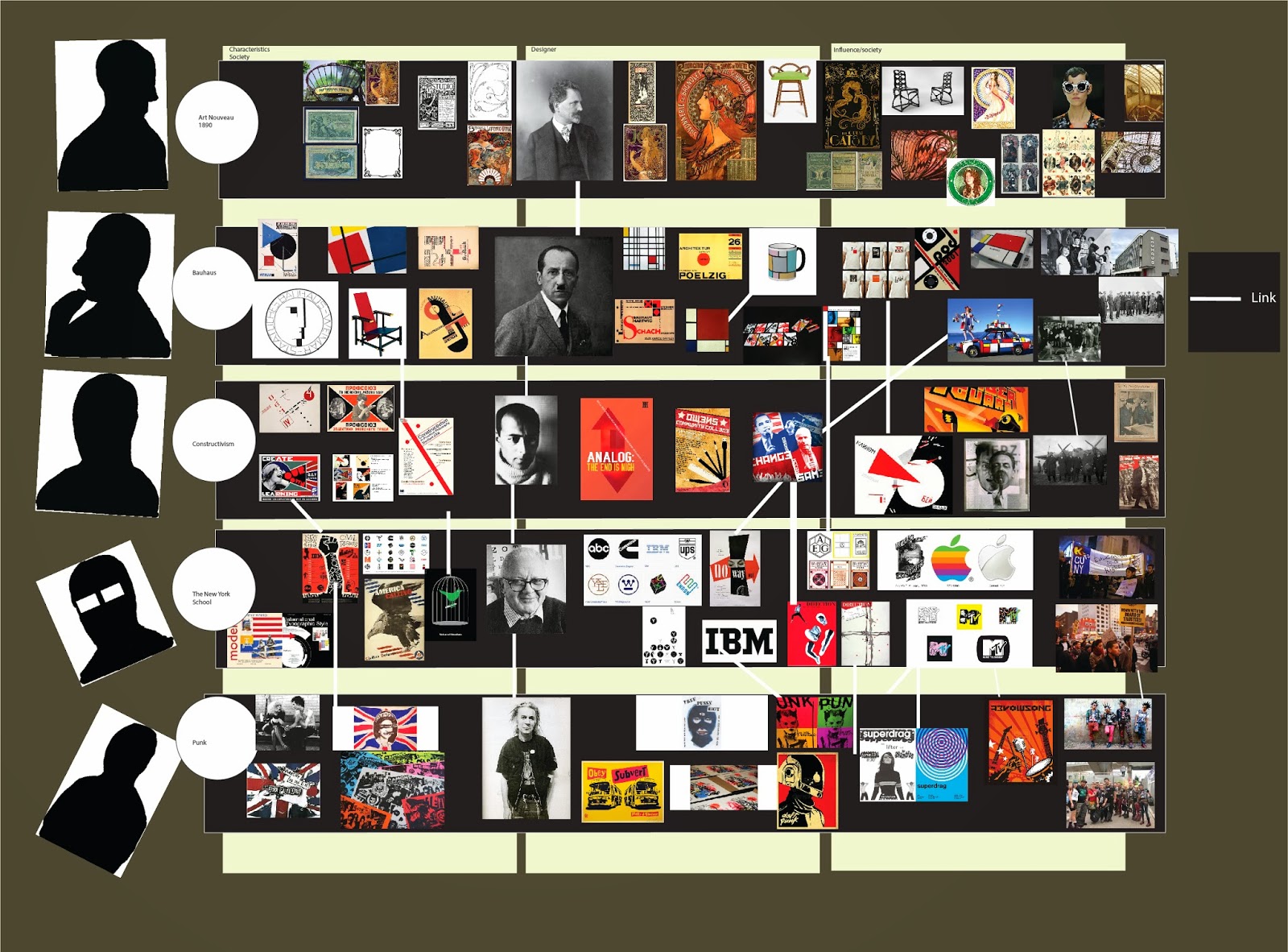
Here is an early influence of post modernism from the punk movement entitled “God save the queen” a design by Jamie Reid for the cover of the sex pistols band, the characteristics of this design could be seen in plenty of the characteristics in postmodern design for example the case of type, no organisation and visual wit in their designs.


The British youth culture magazine, I-D was an iconic representation of the postmodern graphic design aesthetics in its publication in the 1980s, the magazine was designed by Terry Jones, who uses aggressive collages, heavy use of colour, experimental typography, dramatic designs.
An important character of postmodern design is the idea of anti-humanism, which is why many humans do not share the same ideas.  

Reference: 
Bill Moggridge, what is post-modernism in design? [Video] available at: http://curiosity.discovery.com/question/post-modernism-design, [accessed 23rd of December 2013]

Anon 2010, Modernism vs Post-Modernism [blog] available at: http://www.bdavetian.com/Postmodernism.html , [accessed 23rd of December 2013]

Meggs P. B. and Purvis A. W. 1998. 5th Edition. Hoboken, New Jersey: John Wiley & Sons , Inc.